




ICECUBES the comic strip #360
23 13878 Oct 18, 2024

ICECUBES the comic strip #359
72 78732 Jul 05, 2024

ICECUBES the comic strip #358
12 12077 Jun 25, 2024

ICECUBES the comic strip #357
24 15149 Jun 05, 2024

ICECUBES the comic strip #356
39 14006 May 23, 2024

ICECUBES the comic strip #355
40 3520 May 17, 2024

Freeze’s Movie Credits
61 6090 May 03, 2024

ICECUBES the comic strip #354
46 4977 Apr 26, 2024

ICECUBES the comic strip #353
56 15019 Mar 29, 2024

ICECUBES the comic strip #352
40 6170 Mar 15, 2024


ICECUBES the comic strip #359
72 78732 Jul 05, 2024

ICECUBES the comic strip #308
148 22665 Jun 30, 2022

ICECUBES the comic strip #357
24 15149 Jun 05, 2024

ICECUBES the comic strip #353
56 15019 Mar 29, 2024

ICECUBES the comic strip #307
76 14597 Apr 18, 2022

ICECUBES the comic strip #356
39 14006 May 23, 2024

ICECUBES the comic strip #360
23 13878 Oct 18, 2024
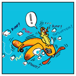
Percy The Flying Chicken #2
126 12793 Mar 21, 2022

ICECUBES the comic strip #358
12 12077 Jun 25, 2024

ICECUBES the comic strip #343
39 11877 Dec 15, 2023

| Friday | +64° | +38° | |
| Saturday | +61° | +55° | |
| Sunday | +58° | +45° | |
| Monday | +44° | +37° | |
| Tuesday | +40° | +34° | |
| Wednesday | +41° | +35° |
No one is online right now

