
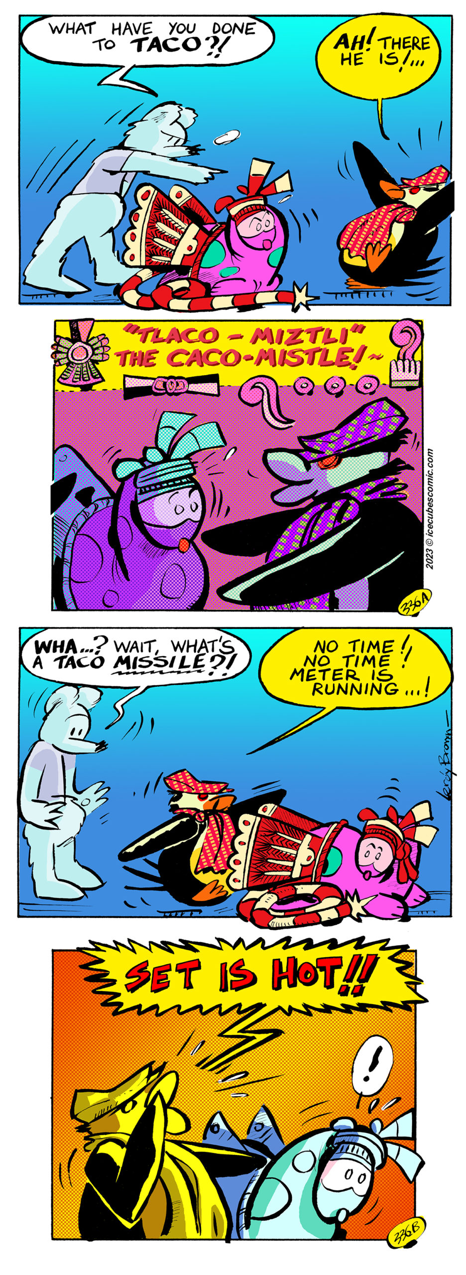
ICECUBES the comic strip #336
Thank you so much for tuning in and be sure to click on the ads!!!
ICECUBES the comic strip. Kindle Vol. 2!
Color matters! Peanuts vs. McDonalds.


Icesticks.
Icesticks.
Icesticks.
Now available as a digital download for only $1.99! Click on the picture!
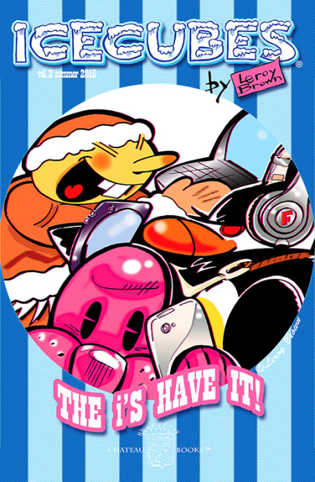
Choose your chapter to start reading:
Latest ICECUBES Comics!
-
1

ICECUBES the comic strip #360
47 26073 Oct 18, 2024
-
2

ICECUBES the comic strip #359
79 79350 Jul 05, 2024
-
3

ICECUBES the comic strip #358
12 12521 Jun 25, 2024
-
4

ICECUBES the comic strip #357
24 15523 Jun 05, 2024
-
5

ICECUBES the comic strip #356
39 14372 May 23, 2024
-
6

ICECUBES the comic strip #355
40 3855 May 17, 2024
-
7

Freeze’s Movie Credits
61 6552 May 03, 2024
-
8

ICECUBES the comic strip #354
46 5374 Apr 26, 2024
-
9
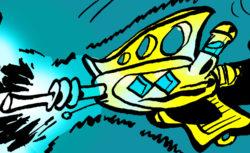
ICECUBES the comic strip #353
56 15469 Mar 29, 2024
-
10

ICECUBES the comic strip #352
40 6541 Mar 15, 2024

Click here to get all the great classic ICECUBES comic strips and exclusive behind the scenes blog posts!
Search by Character:
Eggman Felix Freeze Mickey Nooky Peckinpaw Percy Popeye Susie TacoTop Ten ICECUBES comics!
-
1

ICECUBES the comic strip #359
79 79350 Jul 05, 2024
-
2

ICECUBES the comic strip #360
47 26073 Oct 18, 2024
-
3

ICECUBES the comic strip #308
148 22747 Jun 30, 2022
-
4

ICECUBES the comic strip #357
24 15523 Jun 05, 2024
-
5

ICECUBES the comic strip #353
56 15469 Mar 29, 2024
-
6
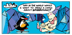
ICECUBES the comic strip #307
76 14670 Apr 18, 2022
-
7

ICECUBES the comic strip #356
39 14372 May 23, 2024
-
8
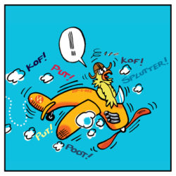
Percy The Flying Chicken #2
127 12982 Mar 21, 2022
-
9

ICECUBES the comic strip #343
39 12580 Dec 15, 2023
-
10

ICECUBES the comic strip #358
12 12521 Jun 25, 2024
Comics Tags:
animated Books Cartoons Christmas Classic Comic Strips Easter Eggman Felix Freeze halloween Happy New Year! ICECUBES marvel Members Only! Mickey Mouse movies Nooky original art Peckinpaw Percy Pogo spiderman Subscribers summer Taco Thanksgiving
ICEBOX Blog Tags:
Recent Comments
- Anonymous on ICECUBES the comic strip #265
- Leroy Brown on ICECUBES the comic strip #359
Categories
Alaska time
| Friday | +64° | +38° | |
| Saturday | +61° | +55° | |
| Sunday | +58° | +45° | |
| Monday | +44° | +37° | |
| Tuesday | +40° | +34° | |
| Wednesday | +41° | +35° |
Archives
- November 2024 (1)
- July 2024 (1)
- June 2024 (1)
- May 2024 (3)
- April 2024 (4)
- March 2024 (5)
- February 2024 (2)
- December 2023 (2)
- November 2023 (1)
- October 2023 (5)
- September 2023 (4)
- August 2023 (1)
- May 2023 (4)
- April 2023 (1)
- February 2023 (1)
- January 2023 (1)
- November 2022 (1)
- October 2022 (1)
- April 2022 (2)
- March 2022 (2)
- February 2022 (2)
- January 2022 (1)
- December 2021 (1)
- March 2018 (1)
- May 2017 (3)
- March 2017 (1)
- December 2016 (2)
- October 2016 (3)
- August 2016 (1)
- June 2016 (1)
- May 2016 (1)
- January 2016 (1)
- November 2015 (2)
- September 2015 (3)
- August 2015 (1)
- July 2015 (2)
- June 2015 (4)
- May 2015 (3)
- April 2015 (3)
- March 2015 (1)
- February 2015 (1)
- January 2015 (4)
- December 2014 (4)
- October 2014 (1)
- September 2014 (1)
- July 2014 (2)
- June 2014 (1)
- May 2014 (7)
- April 2014 (5)
- March 2014 (10)
- February 2014 (9)
- January 2014 (7)
- December 2013 (4)
- October 2013 (2)
- September 2013 (3)
- August 2013 (3)
- July 2013 (3)
- March 2013 (2)
- January 2013 (4)
- December 2012 (3)
- November 2012 (2)
- October 2012 (3)
- September 2012 (2)
- August 2012 (7)
- June 2012 (1)
- May 2012 (5)
- April 2012 (10)
- March 2012 (3)
- February 2012 (1)
- January 2012 (8)
- December 2011 (9)
- November 2011 (5)
- October 2011 (5)
- September 2011 (7)
- August 2011 (6)
- July 2011 (5)
- June 2011 (12)
- May 2011 (17)
- April 2011 (13)
- March 2011 (7)
- January 2011 (4)
- December 2010 (2)
- June 2010 (3)
- May 2010 (10)
- April 2010 (9)
- March 2010 (2)
- February 2010 (2)
- January 2010 (5)
- October 2009 (6)
- July 2009 (1)
- June 2009 (2)
- May 2009 (2)
- April 2009 (3)
- March 2009 (5)
- February 2009 (3)
Search ICECUBES
Online Fans
No one is online right now



One thought on “ICECUBES the comic strip #336”
Leroy Brown
What’s a Taco Missile?!!